Alumni politecnico di milano
In the era of Big Data, disciplines such as information design and data visualisation are crucial to make the enormous amount of information we have in every area of human knowledge understandable and exploitable. Federica Fragapane sure knows that. After graduating in Communication Design at Politecnico di Milano, she succeeded in building a fascinating career in this field, becoming a reference point for the design of infographics for La Lettura, the cultural insert of Corriere della Sera, and going on to collect collaborations with other newspapers, from Scientific American to BBC Science Focus, and with a wide range of organisations, associations and companies ranging from Google to the UN. Never, however, would the 35-year-old have expected that three of her data visualisations would be acquired by the Department of Architecture and Design of New York's MoMa as part of the museum's permanent collection. A great satisfaction, thanks to a creative and experimental approach based on the representation of complexity through visual interfaces other than traditional bar, pie, Cartesian or histogram graphs, and on the idea that aesthetics count as much as content.
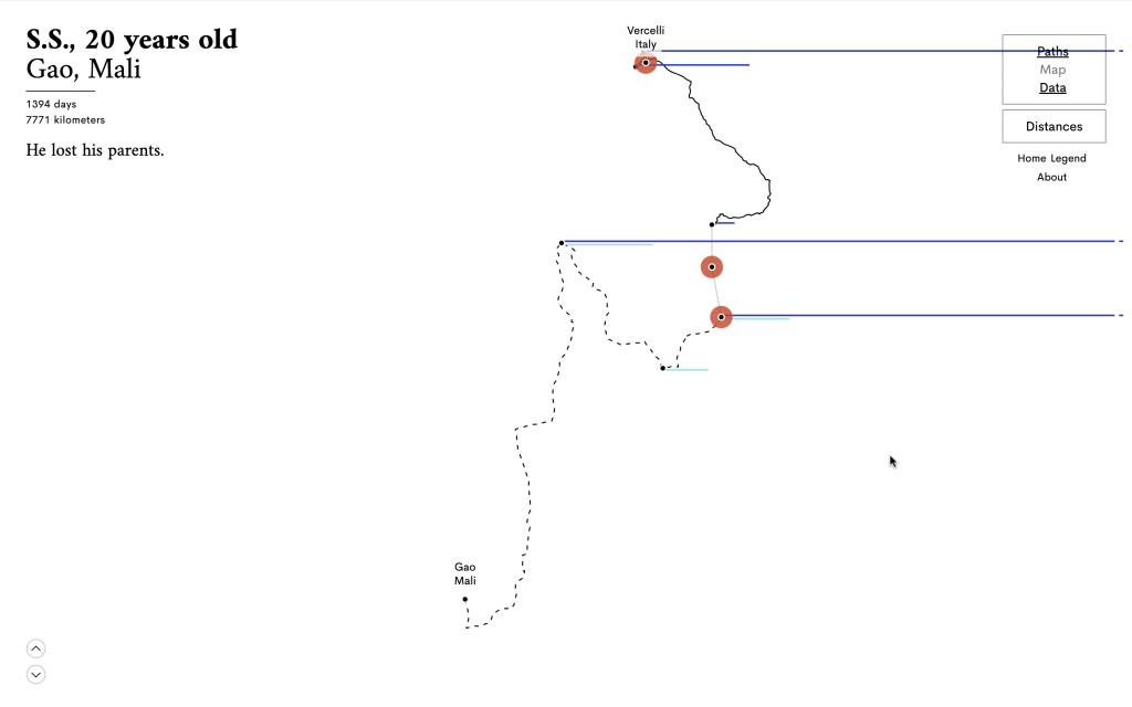
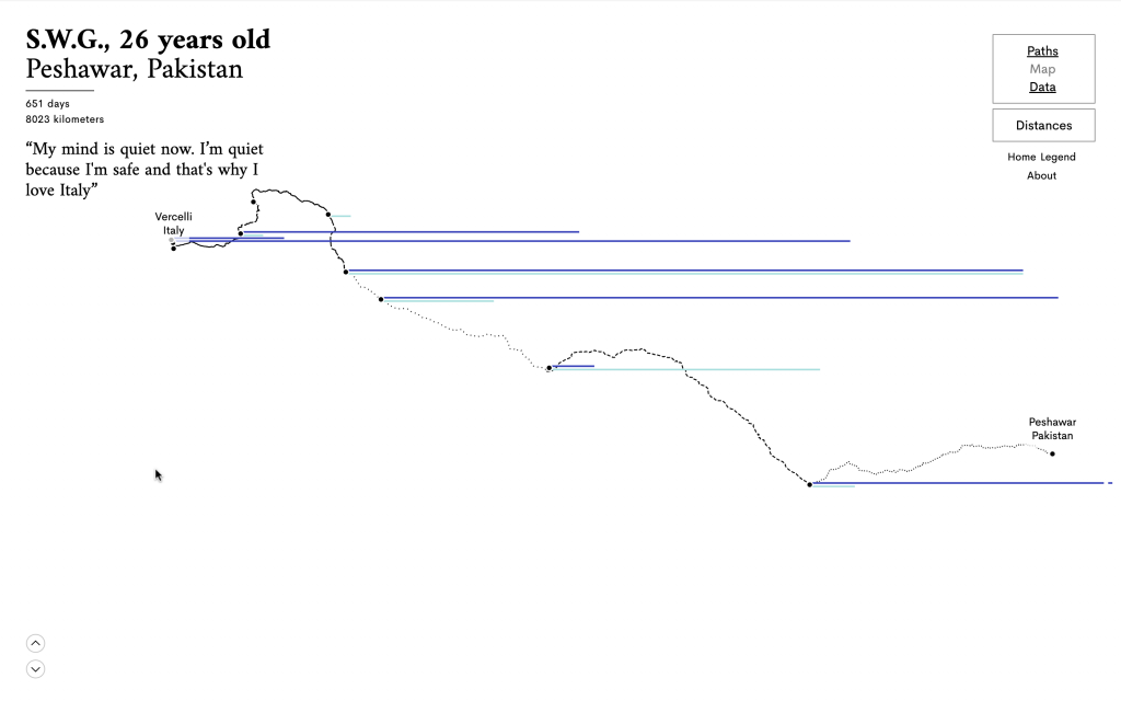
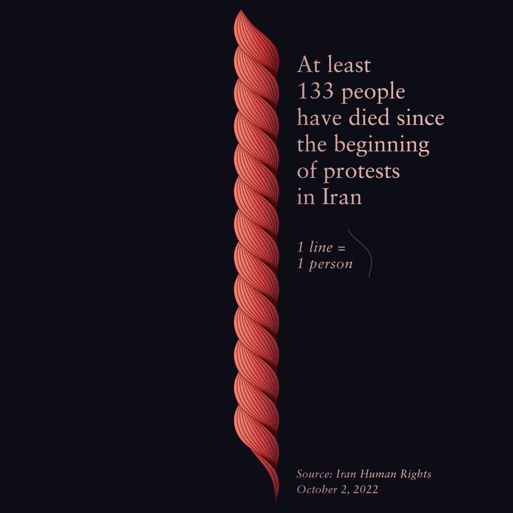
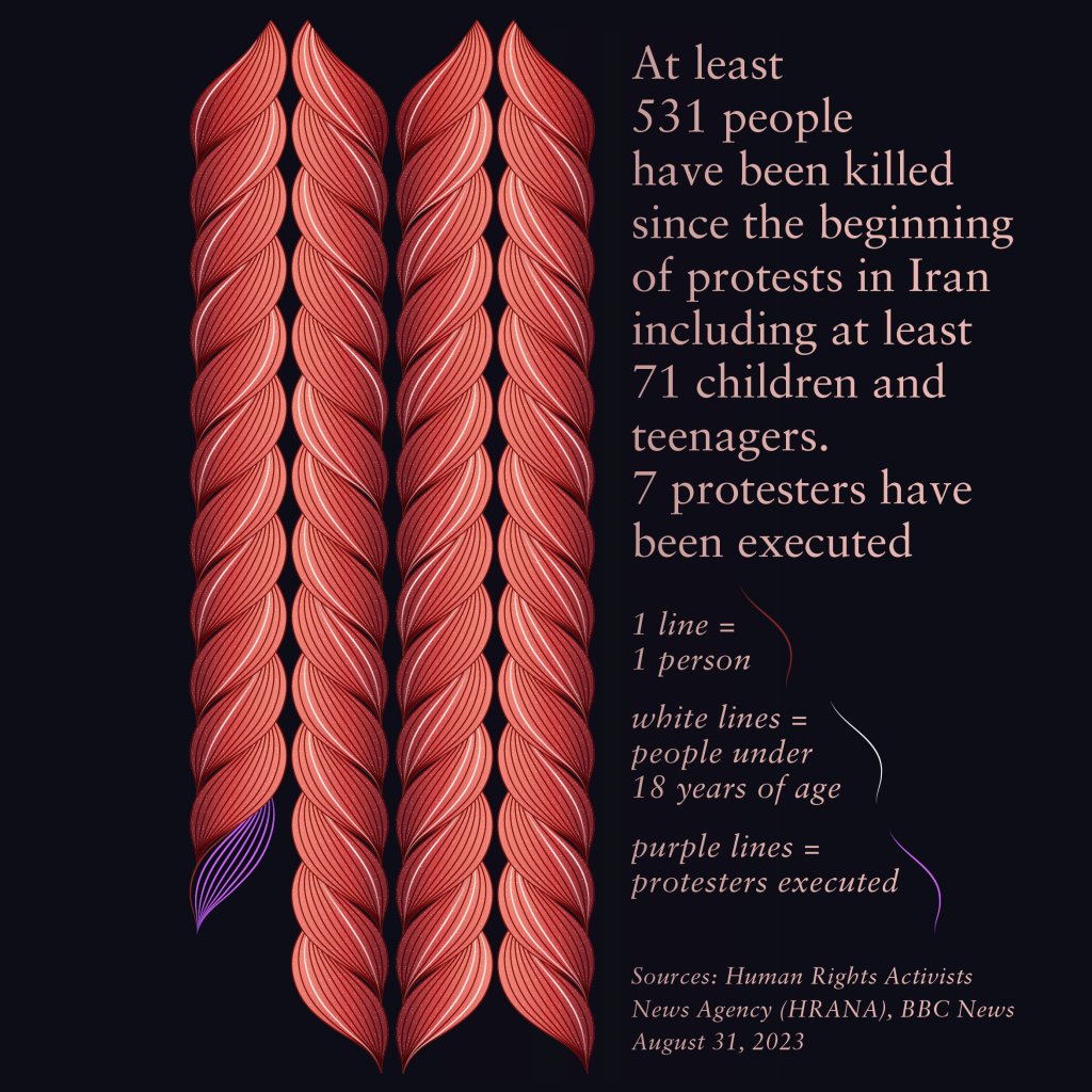
The idea is to graphically suggest aspects that tend to be excluded from purely statistical analysis - which, despite its scientific rigour, risks concealing the many facets of the complexity of reality in which we are immersed and the relativity of our gaze. Meaningful, in this regard, is Federica's choice to draw autumn-hued leaves in one of the projects selected by MoMa, ‘Land Defenders’, published in the magazine Atmos to accompany an investigation by journalist Yessenia Funes and dedicated to the environmentalists killed in Brazil between 2015 and 2019. Or again, to draw a sort of red snake to visualise the levels of CO2 concentration in the atmosphere. It is a matter of focusing on what Fragapane defines as ‘visual words, no less important than textual ones and able, with their evocative power, to give life to a visual tale that is also open to emotion’.
‘After attending university I worked for a few years at Accurat, an information design studio based in Milan and New York, and already there I breathed the air of experimentation,’ says Fragapane. ‘When I became a freelancer, following my instincts and spending a lot of time at the PC and among books looking for visual inspirations, but without necessarily wanting to define a precise style, I found myself attracted above all by what had to do with nature and the world of living organisms. From that moment on, I started to use organic, soft figures, far removed from those that usually populate infographics, and over time this became a conscious and meaningful practice. For me, not only are those forms beautiful, but they also recall two concepts: on the one hand, the life behind the data themselves, the fact that behind the numbers and percentages I outline there are often stories of people or ecosystems, humanity, a “living being”, and I believe it is essential to render this graphically; on the other hand, the relativity, non-neutrality and imperfection of those data, which, beyond the reliability of the sources I use, are inevitably the result of human research.’
Some will object that this approach may undermine the user's perception of scientific merit, but for Fragapane this is a false problem. ‘I think intellectual honesty is needed to state that there is always someone behind the collection and processing of data - which for me does not undermine a study’s authority. On the contrary, that very honesty can strongly contribute to building trust in numbers and science'. Underlying this is the belief that in every information design project clarity and display beauty must be intertwined while adapting to the target audience. ‘It deals with caring about what you do and caring about the group of people you address. Also, when the purpose of a survey is informative, I like to think that an aesthetically pleasing infographic can become an invitation to read and explore. Aesthetics is not a fad, a finishing touch: it is an integral part of the communication process'
Want to read this and many other news stories in full in print format? From January for members will be available the new MAP, the Alumni magazine -> to receive it donate here!
Photo Credit: Wild Mazzini